Predicting the NBA Return to Play using Machine Learning

At the start of the COVID-19 pandemic when working from home began, I decided to take advantage of a privileged opportunity, of being healthy, to dive a little deeper into one of my growing interests, data science. I was inspired by an article about Isaac Newton to begin learning the fundamentals of machine learning and to embark on a small side project. This project is the first of many, and is by no means perfect, but offers an idea of the grassroots analysis involved with my data science experience.
When I started this, I decided to couple my interests with a project centered around a sport that had recently been cancelled. After some initial research, I found that basketball would be one of the easiest to predict, based on the number of historically correct outcomes of betting odds. I figured, if the NBA can’t play, I’ll make my own version of the playoffs, as the return to play schema hadn’t been discussed or released to the public yet. Once the “Return to Play” schedule had been released, the plan switched to predict the eight seeding games and the 2020 NBA playoffs as part of the “Whole New Game” plan. Click here to find all the details about NBA’s “Whole New Game” system.
The approach was simple, mirroring the fundamental design of most machine learning solution structures:
- Collect previous years NBA team statistics to train my model;
- Select 3 to 5 statistics from this collection to be used as inputs or features in my model. This will serve as the training data;
- Fit a logistic regression model to the training data;
- Tweak the model further using cross-validation and threshold tuning, and;
- Use the calibrated model to predict the outcomes of the NBA “Return to play” games.
Sounds like an easy enough strategy. Now let me take you through how I went about it, and some of the first project growing pains that went along with it.
Collecting the training data
To start, the basic end of year statistics were downloaded for each team from the years 1999 to 2020. The 2020 numbers would be the current team statistics as the remainder of the season had been cancelled due to the COVID-19 pandemic. Unfortunately, using the end of year statistics is called data snooping, a form of data leakage. This is because the training data is comprised of information from the end of the season. When the model is used in the real world, it will be impossible to use end of season statistics (the most recent will be used), so the environment that the model is trained on will not be able to be replicated, leading to some slightly skewed results. As mentioned, this model is by no means perfect.
Selecting the features; big things come in small packages
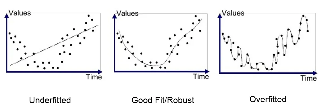
After playing around with varying numbers of features to be used as inputs into my model, I found that three to five would be the most optimal for my circumstances. With too many features, the machine learning model can make future predictions that are too heavily calibrated to the training data, this is called overfitting. With too little features, the model can make future predictions that are too general, this is called underfitting.
Once the rough number of features needed was narrowed down, I calculated the correlation between all of the end of year statistics to see the dynamic and magnitude of impact that certain stats had on others, and ultimately, the outcome of the game.

Some interesting findings were identified. The number of 3-pointers made and attempted are both greatly negatively correlated with the number of offensive rebounds. Perhaps because 3-pointers don’t allow enough time for front-court players to get underneath the basket. As well, block attempts have a strong negative correlation with win percentage. This could mean that more block attempts means more fouls, putting your opponent on the line for easier shots. It could also, and more presumably, mean that if your opponent is beating you, chances are they’re taking more shots, resulting in higher block attempts by your team. As interesting as the abundance of other correlations we have available to analyze, we’ll return to the main problem at hand.
At the end of the day, the statistics that would impact a win or loss the most, would be the most important, so I chose to use the three statistics with the highest absolute value correlation to Win %. They were:
- +/- — The point differential when the team is on the floor.
- Net Rating — A team’s point differential per 100 possessions.
- PIE —A team’s overall statistical contribution against the total statistics in games they play in. For example, if Team A contributed more rebounds to the total game rebounds than Team B, Team A would have a higher PIE. This methodology is combined across basic statistics to generate the PIE for a team.


Training the model; practice makes perfect
I used a logistic regression model as it is simple and robust. I felt it would be better to get it right with a simple model than attempt something overly complex. The logistic regression is a type of classifier that uses a sigmoid function to assign probabilities of class membership to each sample. In our case, we have two classes: 1, (team 1 wins) and 0, (team 2 wins). If the probability is above a certain threshold, it will be classified as a 1. If it is below that threshold, a 0 will be assigned.
I used the outcome and the three selected statistics that correspond to both teams for every game played from 1999 to 2020 as the training data for my model. This data was fitted to my model, and the training begun!
Tuning the model; ironing out the wrinkles
Upon initial investigation, I found that the training data was slightly imbalanced. Historically, the data showed that 60% of the time the home team won, which meant that the threshold to determine if a team won or lost, could not be the standard 50%. To resolve this, I conducted a type of threshold tuning called ROC Curve analysis which produced an optimal threshold of 60%, aligning well with the imbalance portrayed in the data. Moving forward, for the home team to be considered the winner, it had to produce a probability from the model higher than 60%, otherwise, the away team would be considered the winner.
After tuning a few more parameters it was time to test the model. I used cross-validation as a testing mechanism to generate the accuracy score of the model. First, cross validation splits the training data into two sections: a training set and a test set. As its name suggests, the model trains on the training set and then tests its predictions on the test set generating an accuracy of correctly predicted results. To ensure that every piece of data has the opportunity to play the role of the training set and the test set, cross validation performs this split five times (or however many you’d like) and calculates the average of the accuracy for each training-test split.

My model displayed an accuracy of 69% +/- 0.02, so I decided to go ahead with applying it to the NBA return to play schedule and playoffs.
Predicting the NBA Return to Play; show time
The remainder of the NBA 2020 season consists of 8 games for each team that determines the playoff seeds. The model predicted these games for each team, generating the end of year standings for the western and eastern conference. These standings are captured in the figure below.

It is important to note that, unfortunately, the nature of the Return to Play format renders no “Home-Away” game effect as all teams are playing in Florida with no fans in attendance. With that being said, the model is trained on data that incorporates that “Home-Away” game effect and has its threshold tuned as such (recall the 60% threshold that this model uses). So to maintain the structure of the model, the 60% threshold will also be used when predicting the Return to Play. For each game, one of the teams was randomly assigned as the home team, and the other team was assigned as the away team. In a perfect world, the past 20 years of NBA games (and the totality of the training data) would be played in Florida, but we’ll have to make do with what we have. Like I said, growing pains…
With the Thunder and the Rockets making some late season charges, its shaping up to be an exciting playoffs. But before we unveil the NBA Champion, let me explain the semantics of the NBA playoffs:
- Typically, there are 8 teams (of the total 16) per conference that vie for the NBA Championship. For this year, if the 9th place team is within 4 games of the 8th place team, they must face-off in a play-in tournament to secure the final 8th seed. This is the case in our circumstances, describing why there are 9 teams per conference.
- Teams must win a Best-of-7 series to advance to the next round. But, this model aims to predict the better team overall. As such, for a seven game series, it will predict the team it thinks is best by a margin of 4–0 almost every time. At the end of the day, all we care about is who makes it to the next round, whether they accomplish that in four games or seven, so I’ve laid out the bracket as such.
- Throughout a seven game series, the higher seeded team plays four of those games at home, compared to the lower seeds three games at home, and is therefore said to have the “home advantage”. Of course this doesn’t happen this year with all the teams playing in Florida. So, for the model, we have formatted it as such; the higher seed is the home team, and the lower seed is the away team.

Well there you have it. The Thunder ended up being beat out after their late season run. As they were the “Away” team, the Mavericks only required a 40% chance of winning from the model to be considered the winner, due to our threshold tuning. There seems to be one final error as the Bucks are beating my hometown favourite Raptors with a 78% probability, but as with the other nuances, we’ll let that one slide.
I hope you enjoyed my walkthrough of this machine learning side project. As mentioned, this is the first of many, so please excuse some of the growing pains. Up next, I hope to analyze the balance between skill and athletic ability involved with different sports or dissect what proportion of results can be attributed to the driver or the car in Formula 1.
Until then, I’ll be tuning in to the NBA playoffs to see if my prediction is right and the Milwaukee Bucks are presented with the Larry O’Brien trophy!
Edit: October 22, 2020
Checking the results; back to reality
Who are we kidding, everyone thought the Bucks were going to win it this year. They were a consensus pick to win it last year and came up short, no one thought that lightning would strike twice — but it did. The story of the playoffs was the Miami Heat stunning the league by beating the championship favourite Bucks on their way to the first NBA finals in the post-Lebron era. They were met by a strong opponent in the Lebron-led LA Lakers and King James reminded us again of the argument that he should be crowned G.O.A.T. Lebron’s first Larry O’Brien and Bill Russell trophy combo in LA meant he is the only NBA player in history to be named in the NBA Finals MVP with three separate teams. The NBA return to play bubble certainly lived up to the hype with an extremely exciting playoffs. Although the timing and logistics of next season are still uncertain, I’m sure NBA fans around the world are patiently waiting for another year of unpredictability.
Speaking of predictability, checking in on the predictions my logistic regression model made back in July, you can see below that it was also stumped. For the NBA playoffs, my model achieved an accuracy of 52%. This was calculated by dividing the number of correct predictions (17) by the total number of predictions (33) — this includes predictions of the playoff seeds and the outcome of the playoffs themselves. Given this was my first try at this, I’m still happy it was above 50%, although I was hoping for something slightly more accurate. Oh well, all that is left to do is learn from the mistakes in this one, refine, and move onto the next project. Please see the below for a detailed view of the predictions my model made and the actual results.

About the author
Cameron Butler is a recent Mechanical Engineering graduate from Queen’s University. Currently, he works as a Business Transformation Management Consultant with EY in Toronto, Canada. He is a beginner and enthusiast of data science, working to identify and apply tangible evidence to solve business problems.
For the code, refer to the github. For any questions or comments, reach out at cpmbutler@gmail.com.